Citation Canada
Formerly HRdownloads
HR and Heath & Safety Solutions
.jpg)
ROLE
Intermediate UI/UX Designer
DURATION
2 years, 11 months
TEAM
Terra Aartsen, Jules Neufeld, Jesse Ervin, Jake Brown, Vassilia Amado, Megan Demaree, Natalia Osojnik, Rebecca Whitney, Sharon Wang, Sangeetha Josheph, Amandeep Kaur.
TOOLS
Figma, Sketch, Invision, Jira, Miro, Photoshop
OVERVIEW
During my time at Citation Canada, I was an Intermediate UI/UX Designer working on the company’s suite of HR and compliance software tools. My work began as the sole designer on their Performance Management platform, where I collaborated with project managers, developers, QA specialists, and department managers to improve usability and efficiency. Early on, I built the company’s first functional design system to streamline our workflow and led its first-ever usability testing initiative, gathering valuable insights that shaped future product iterations for the Performance Management platform.
After the UK-based Citation Group acquired our company, I played a key role in the rebrand and redesign of the Performance Management platform and other products, bridging communication between the Canadian and UK design teams and delivering the first rebranded launch in just one month. I later contributed to several of Citation’s broader HR products and designed soft-launch experiences for new tools within the shared portal. I initiated an accessibility audit that improved the inclusivity of the parent company’s design system.
TIMELINE
-
2022–2023: HRdownloads - Core Products & Design System
-
2023-2024: Acquisition & Rebrand (Citation Group)
-
2024–2025: Multi-product UX + Accessibility Work
Unified Design System (Pre-Rebrand)
OVERVIEW
To eliminate inconsistencies across our 20+ HR products, I built a functional, centralized design system that standardized colour, typography, user profiles, and other UI components. Every component was fully linked; any update made to the design system automatically propagated across all product files, eliminating the need for copy-paste workflows.
What I Did
-
Audited UI patterns across 20+ products
-
Consolidated components into one shared, scalable library
-
Rebuilt components for AODA / WCAG 2.2 compliance
-
Enabled automatic system-wide updates controlled from a single source
Why It Mattered
-
Ensured visual + interaction consistency across the entire ecosystem
-
Reduced duplicated design/engineering work
-
Improved accessibility and usability
-
Accelerated product rollout
-
Created a long-term foundation for future product development
Although the visuals below are from the pre-rebrand design system, the underlying architecture, components, and accessibility standards I built became the foundation for the new brand system adopted across the company.
Performance Management
PROBLEM / OPPORTUNITY
-
Performance reviews, 1:1s, and goal tracking were inconsistent across departments, leading to unclear expectations and disengaged employees.
-
Managers lacked visibility into employee progress, and employees had no structured way to set or track goals.
-
There was an opportunity to create a centralized, data-driven platform that improved alignment, visibility, and employee growth.
MY ROLE
-
Partnered with the project manager to define scope and align on user needs.
-
Created wireframes and high-fidelity prototypes for stakeholder review.
-
Conducted first company-wide usability testing to validate design decisions.
-
Managed all product design files and documentation.
-
Analyzed feedback from the internal team and users post-launch to inform continuous improvements.
-
Led rebrand initiatives during acquisition.
SOLUTION
The solution was a centralized performance management platform that unified goal setting, progress tracking, and performance reviews across the organization. Designed to bring consistency and transparency to the review process, it provided a structured, data-driven approach to employee development and performance visibility. By standardizing workflows and integrating feedback, goals, and analytics in one place, the platform improved alignment between employees and managers, enhanced accountability, and supported continuous growth at both individual and organizational levels.
The following screens highlight the key features of our Performance Management product and show how it appeared during our initial rebrand launch, which we delivered within a one-month timeline. We prioritized simple, low-disruption updates such as new primary colors, refreshed typography, the removal of mascots, and a few targeted UI refinements.

Dashboard
The dashboard provides managers with a clear overview of pending performance reviews, 1:1s, and goal updates, all in a single intuitive workspace.

Table view
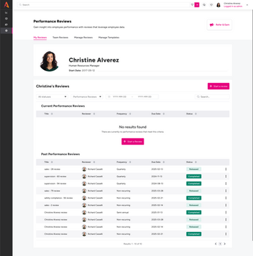
Managers and employees can view personal, team, departmental, and company goals in a sortable table. The table view supports filters for time range, progress, and ownership, making it easy to track alignment and outcomes. Performance Reviews and 1:1s have a similar table view.

Goals
Provides a deep dive view into each goal, including progress metrics, comments, due dates, historical updates, and more. It brings transparency and accountability by showing a clear record of goal evolution and completion.

Performance Review
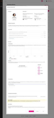
The performance review section allows managers to schedule, assess, and document employee reviews directly within the portal. It streamlines the entire evaluation workflow from scheduling to completion, while keeping all data secure and accessible.

1:1s
This section enables managers and employees to set 1:1 meetings, track discussion topics, and manage short-term goals collaboratively. It encourages consistent feedback loops and progress tracking, promoting engagement and growth.

Setup pages
The setup feature allows admins and managers to create new 1:1s, individual or group goals, and performance reviews through a guided, multi-step flow. Each flow requires the user to input key details before being sent to the appropriate employee or team. At the end of the process, users can review all information entered and finalize the setup for the 1:1, goal, or performance review.
Usability Testing
OBJECTIVE
After launch, we identified a major gap: the company had never collected structured user data or usability insights. Given the complexity of Performance Management, it was crucial to understand how our designs performed in real workflows.
We ran moderated usability testing sessions with 15 internal and external users, asking them to complete key tasks, such as setting a 1:1, creating a goal, initiating a performance review, and finding employee performance metrics. We measured time-on-task, tracked errors and completion rates, observed navigation behaviors, and used think-aloud methods to capture quotes and points of hesitation.
This mixed-methods approach helped us uncover friction points, mental-model mismatches, and clear opportunities for redesign across the product.
USABILITY TESTING REVEALED THE FOLLOWING KEY FINDINGS:
01) Overwhelming Setup Experience
Users found the full-page setup screens too dense and mentally exhausting. Long scrolls, repetitive fields, and unclear copy made the process feel tedious and difficult to complete confidently.
“It feels like so much information at once. I’m not sure what’s important, and I'm not sure if I'm doing it right.”
02) Difficulty Finding Metrics & Targets
Managers and admins struggled to locate the metrics they needed day-to-day. The old layout buried key data, forcing users to click around multiple areas or leave the flow entirely to find what they needed.
"I want to be able to find key metrics easily to write up my reports."
03) Confusing Navigation Between Table View & Setup / Details Page
Users frequently got lost when moving between table views and detailed pages. Many relied on the browser back button and were frustrated when they landed on unexpected screens for setup or details pages.
"I keep ending up somewhere else, am I still in the same workflow?"
04) Difficulty locating Past 1:1s, Reviews, and Goals
Users had trouble finding past records because the layout required extensive scrolling through current items before reaching historical ones. This made it unclear where past content lived and caused users to assume it wasn’t available.
"I didn’t even realize I had to scroll that far to see the older ones."
05) Desire to Check Off Completed 1:1 Action Items
Participants wanted a simple way to tick off completed action items and reference a historical log. Without this, actions were easily lost or forgotten between meetings.
“I need a record of what I finished, otherwise things just disappear and doesn't feel like I accomplished much.”
Here’s How We Solved Those Issues
01) INTRODUCED A RIGHT PANEL SETUP WORKFLOW
To address the overwhelming setup experience and the confusing navigation between table views, setup flows, and detail pages for goals, performance reviews, and 1:1s, we introduced a right-panel layout.
After extensive discussions with project managers, user researchers, and other stakeholders, we identified several friction points in the previous workflow. We removed input fields that contributed little value (based on user research), combined related steps to shorten the perceived workflow, and transitioned to a horizontal progress bar that fits more naturally within the right-panel layout. We also optimized spacing to reduce long scrolls, clarified labels, and simplified the overall visual hierarchy to lower cognitive load.
Importantly, we kept portions of the main screen visible behind the right panel. Users previously reported feeling disoriented when navigated away to a full-page setup view; maintaining this visual anchor preserves context and reduces the sense of switching between disconnected workflows. It also enables users to quickly reference information in the background without fully navigating away.
Overall, the right-panel layout supports clearer information hierarchy, progressive disclosure, and more intuitive navigation, resulting in a setup experience that feels lighter, faster, and easier to understand.


02) ADDED DATA-RICH YET MANAGEABLE OVERVIEWS
To address the recurring feedback around difficulty finding metrics and targets, we introduced a mini-dashboard above the table view. This dashboard provides users with a quick summary of their progress at first glance, reducing the need to dig through multiple screens to understand performance trends.
The metrics we chose were directly informed by user interviews, where managers consistently highlighted what they found most valuable when reviewing performance and planning next steps.
Since some users expressed concerns about cognitive load, we included a “Hide stats” toggle, giving users control over how much information they want visible. By default, stats are shown to promote quick insight, but the interface remains flexible for those who prefer a more minimal view.
Overall, these changes helped create a more efficient, data-forward experience that surfaces insights without overwhelming the user.


Users, especially managers and admins, shared that accessing Goals Key Results required too much clicking and scrolling, particularly when they needed to evaluate progress across multiple objectives. To support this, we made each table row expandable and collapsible, allowing users to preview Key Results inline, which improved scannability, reduced page transitions, and made the most important information immediately visible in context.

Supporting the Multi-Brand Rebrand Rollout
OVERVIEW
As part of the company-wide rebrand and consolidation of acquired businesses across Canada, the UK, and Australia, I supported several soft launches of new products within our existing portals. The goal was to introduce new brands and capabilities without confusing users or interrupting their workflows.
TIMETASTIC SOFT LAUNCH (CITATION CANADA)
What I Did
-
Created a clear, branded multi-step onboarding experience
-
Communicated value, data-sharing details, and privacy expectations
-
Designed logical flows for first-time setup, errors, and exit states
-
Ensured language, layout, and interaction patterns aligned with both the portal’s UI and Timetastic’s brand
-
Incorporated both Citation Canada and Timetastic's branding
Why It Mattered
-
Enabled the company to introduce a new product seamlessly
-
Reduced confusion for existing customers during the acquisition transition
-
Maintained visual consistency during a period of brand consolidation
-
Provided a clear warning that users were leaving the main platform
-
Introduced the new business in a controlled, minimal way
These screenshots show one of the branded onboarding experiences I designed for Timetastic, a new time-off management tool introduced into the Citation Canada (formerly HRdownloads) portal.
OTHER REBRAND WORK
Alongside Timetastic, I also designed the internal landing experience for Rotas + Workforce Management, another new product being introduced across the platform. This required aligning the product’s brand with our portal UI, developing a clear value narrative, and ensuring the launch fit seamlessly into existing navigation patterns.
(This work was completed prior to public release, so visual previews are not included)


