Career Peer
Empowering women with the skills, best practices, and confidence needed to enter the workforce.
.png)
ROLE
UX Designer
UX/UI Researcher
DURATION
4 Months
TEAM
Ada Celik, Devlin Cousins, Daniella Alvarado, Michaela Jenkins-Moss, Noemie Toutant, William Lee.
TOOLS
Figma, Illustrator, Miro, Notion, Photoshop
THE CHALLENGE
Design a digital service that addresses one of the United Nation's Sustainable Development Goals.
BACKGROUND
The gender pay gap is a widely recognized indicator of economic equality that is prominent in various industries and professional levels. Deeply engraved societal gender roles lie at the root of the gender pay gap in negotiated outcomes
On average, 76.8 cents is earned by full-time working women in Canada for every dollar men make. The Labour Market Information Council found women earn 12%, or $5,700, less than men one year after graduation (Canadian Women's Foundation, 2017). That difference widens to $17,000, or about 25%, in the five years following graduation (Finnie et al., 2020).
Pay gaps that begin early on in women's careers create a foundation of inequality and vulnerability that affects the course of their careers, and ultimately, their lives.
RESEARCH
Before designing our digital service, it was crucial that we understood our user's pain points and empathized with them. To do so, we conducted a benchmark analysis to explore existing solutions and identify areas for improvement. We found that other platforms were difficult to navigate, expensive, and inaccessible.
We then conducted user research by proxy through various channels like Reddit, Facebook groups, app store reviews, and employment websites. Through this, we were able to confirm our initial assumptions. On Reddit, we noted various female-focused career advice subreddits and the struggles, insights, and resources that women were sharing and discussing with each other
We also distributed surveys and conducted user interviews with female post-secondary students regarding their career development skills and asked them specific questions about what they wished they knew or what they want to learn more about before entering the workforce.


DEFINE
All our research data was written on sticky notes and brought into our Miro board. The sticky notes were then organized into groups in order to determine the key themes in each data set. We then used the Core 4 framework to synthesize our findings and identify our key findings.
KEY FINDINGS
1) Searching for different categories of career development tips (resume, negotiation, and cover letter) is inconvenient and tedious
2) Slow response rates from mentors online
3) General lack of confidence and knowledge amongst women when it comes to negotiation and other career development skills
4) Lack of free resources for mentorship/counseling
After we synthesized our data, we created detailed user personas.


IDEATE
After conducting our research and fleshing out the personas, we used Miro to build our user flow. We used this user flow as the backbone for our sitemap. Once we mapped out the user flow, we were able to prioritize the screens that needed to be prototyped and created a project roadmap.

PROTOTYPING
We split this project into three iterations, completing different goals for each one. Our prototype underwent many changes for each iteration based on the feedback gathered from usability testing and our professors. The UX/UI team sketched out various low-fidelity website layouts and collaborated to pick and choose the best features. Once we were confident in our low-fi designs, we moved on to create hi-fi designs to visualize what our website could look like.


Once we had a solid understanding of our vision, we created a style guide that would help the team collaborate better and create consistent designs. We finalized our style guide before designing hi-fi designs.


USER TESTING
Due to the COVID-19 pandemic, we conducted remote user testing through Microsoft Teams using the screen share feature. We used a Think-Aloud approach and prompted our users with three user stories/tasks like booking a consultation with a mentor for interview advice. Simultaneously, we took notes of user errors and useful insights that came to light on each screen. We used those notes to further improve our prototype.
The user research team placed all the user testing notes on Miro and then turned them into comments on Figma for the UX/UI team to see the appropriate changes that need to be made.


Due to the COVID-19 pandemic, we conducted remote user testing through Microsoft Teams. We used a Think-Aloud approach and prompted our users with three user stories/tasks, like booking a consultation with a mentor for interview advice. Simultaneously, we took notes of user errors, and useful insights came to light on each screen. We used those notes to further improve our prototype.
The user research team placed all the user testing notes on Miro and then turned them into comments on Figma for the UX/UI team to see the appropriate changes that need to be made.
Here are some important changes we made to our prototype:

After user testing, we figured that users were confused by the content of our home page and felt like they were thrown into the brand's features without an introduction. We decided to make the homepage more informative, including a brand slogan, a summary of our main features, top mentors, and user testimonies. We also included multiple call-to-actions throughout the page. These changes allowed us to explain our brand, build trust, and promote engagement.
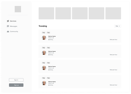
Along with that, we also found out that the vertical navbar and mentor cards were inefficient. To change that we adopted a horizontal navbar and significantly reduced the size of the mentor cards. Doing so, we were able to make better use of space.


We advanced our messaging system because it proved to be overly simple and it didn't reveal enough information about the participants in a conversation. To change that, we added profile pictures next to each message to identify who sent the message, read receipts on each message, and a clear description of the mentors with their profile pictures.
This way, we were able to reduce the steps a user would have to take to find out information about the person they are messaging. All required information was made easily accessible on the messaging system.

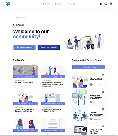
In our initial design, the "Community" tab included all the community features and the free resources.
User testing demonstrated that locating free resources was counterintuitive because users associated the term "community" with group activities rather than a list of tips to improve an application package. Therefore, we created two separate tabs: "Community" and "Resources".
By creating two separate tabs, we were able to make it clear to the users that each served a unique purpose. Our design became more intuitive and our website became easier to navigate.

FINAL PROTOTYPE
CareerPeer is a not-for-profit online platform committed to helping women kickstart their careers and remain active in the workforce. The platform creates opportunities for women to engage, on their terms, with mentors and industry professionals through personalized 1:1 consultations.
CareerPeer's Core Values:
-
Encourage initiative and risk-taking through empowerment.
-
Act with uncompromising honesty and integrity in everything we do.
-
Satisfy our customers with innovative technology and superior quality, value, and service.
-
Value everyone and treat people with dignity and professionalism.
-
Respect our social and physical environment.
Get started
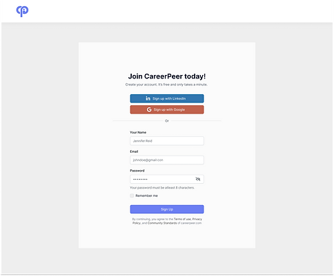
Users can join CareerPeer by manually making an account or by connecting their LinkedIn or Google accounts.

Booking 1:1 consultations
Users can easily book an appointment with a mentor by checking for availability on the mentor's profile. There, they will also find the mentor's credentials.

Free Resources
Users can take advantage of an extensive library of free resources that can help them refine their resume, cover letter, interview skills, and negotiation skills. They can also contact the author of each article.

Events & Threads
Connect with peers by reading, writing, and replying to threads. You can also view and attend upcoming events.
REFLECTION
Overall, I thoroughly enjoyed being a part of this project despite all the ups and downs. Due to the COVID-19 pandemic, some members of the team were in different time zones, which meant we all had to make adjustments and compromises. Although it wasn’t the ideal working environment, I learned a lot about effectively adapting to such group situations.
During this project's early stages, we struggled to determine our target audience. There were multiple discussions on why or why not we should target male users as well. The group was divided since everyone had different perspectives and explanations for it. This was the first time I worked in a group with people who had such strong opinions. To maneuver this situation, I suggested we seek help from a mediator (our professor) who can guide us to reach a suitable conclusion. In the end, it all worked out, and I learned a new skill of diffusing a situation.
Throughout the prototyping stage, I learned about a few helpful features of Figma. Although we didn’t use any animations, while prototyping the rating system for CareerPeer, I was able to experiment with the smart animate feature of Figma, which I then used in another project. Additionally, this was the first time I was introduced to components on Figma. Though a little tricky to use at the beginning, they are very helpful to create and manage consistent designs.
Lastly, I learned the importance of checking for accessibility issues. During our first user testing, some users noticed the tags on mentor cards were not legible. Since I oversaw the colour palette, I put the foreground and background colours of each tag through a contrast checker on WebAIM and found that none of them passed the test. To make our design accessible, the colour palette was changed for the second iteration.

